
This collection features 10 fonts that work especially well for expressive headlines, ad creatives, websites, posters, and branding.
I deliberately chose typefaces with very different personalities, from delicate editorial styles to bold display fonts. For each one, we’ll include a design example and a download link.
At the end of the article, you’ll also find a curated collection of 150 fonts gathered in a single Figma file. You can quickly see how each font looks and jump straight to the one you want to download instead of searching for it across the web.
1. Mak
Mak is an expressive font with a delicate, unusual character. It works well when the headline needs to become a noticeable part of the composition without falling back on a standard neutral sans serif.
It works especially well for:
- fashion projects;
- beauty brands;
- editorial design;
- large website headlines;
- minimal ad layouts.
Mak looks best at larger sizes with plenty of space around the text.
Download MakLink will be added
2. Kudry
Kudry is much more decorative. Its thin strokes and distinctive letterforms give it enough personality to become the main visual element in a composition.
Try it for:
- fashion;
- beauty;
- premium packaging;
- editorial layouts;
- posters;
- distinctive headlines.
There is usually no need to add much extra decoration around it. Kudry already has a strong visual character of its own.
Download KudryLink will be added
3. Berold
Berold combines a classic feel with more unusual letterforms.
It is a good option when a conventional serif feels too restrained, but fully experimental typography would start to distract from the design.
It works well for:
- branding;
- fashion;
- posters;
- packaging;
- landing page headlines;
- brand campaigns.
Berold is especially effective in short phrases and names.
Download BeroldLink will be added
4. Dance Partner
Dance Partner is a light, very thin typeface with a clear editorial feel.
Because of its letterforms, it works better for large headlines than for long blocks of text. At that scale, the typography itself becomes part of the visual.
Try it in:
- websites;
- fashion projects;
- magazine-style layouts;
- beauty;
- branding;
- clean, minimal posters.
Dance Partner looks especially good alongside large photography.
Download Dance PartnerLink will be added
5. Christopher
Christopher is very different from the previous fonts. It is a handwritten typeface with a lively, personal feel.
It works well as an accent when a design needs the look of a handwritten signature or a more expressive tone.
For example:
- fashion;
- personal brands and creative projects;
- cosmetics;
- events;
- posters;
- short accent phrases in ad creatives.
Use it sparingly. A single word or short phrase is often enough.
Download ChristopherLink will be added
6. Soledago
Soledago is a bold display font that is hard to ignore.
Its heavy, unusual forms make it a strong choice when the headline needs to work almost like a graphic object.
Good use cases include:
- music posters;
- fashion;
- event graphics;
- branding;
- ad creatives;
- experimental typography.
Its personality can become overwhelming in longer text, but one or two words can easily anchor an entire layout.
Download SoledagoLink will be added
7. Custodia Deco
Custodia Deco feels thin, geometric, and decorative.
It works well in projects that need an elegant headline without the traditional feel of a classic editorial serif.
Try it for:
- beauty;
- architecture;
- interiors;
- fashion;
- premium products;
- websites built around large typography.
It works especially well against a simple grid with very few competing elements.
Download Custodia DecoLink will be added
8. ReedReds
ReedReds is an experimental geometric font with a futuristic feel.
It immediately sets a specific visual direction, so it will not suit every project. But it can work very well when a conventional sans serif feels too safe.
For example:
- music;
- streetwear;
- tech;
- digital projects;
- creative studios;
- festivals;
- experimental ad layouts.
Use it large, and avoid surrounding it with too many other decorative elements.
Download ReedRedsLink will be added
9. Vetrino
Vetrino is one of the more restrained options in this collection.
It still has distinctive letterforms and looks strong at larger sizes, but it does not dominate the entire composition.
That makes it flexible enough for:
- websites;
- beauty;
- fashion;
- branding;
- presentations;
- advertising headlines;
- editorial design.
It is a good choice when you want something less conventional than a standard sans serif without making the typography too experimental.
Download VetrinoLink will be added
10. Lozung
Lozung is the complete opposite of the delicate fonts at the beginning of this list.
It is heavy, compact, and energetic — a strong choice for short headlines that need plenty of visual weight.
It works especially well for:
- ad creatives;
- sports;
- streetwear;
- events;
- posters;
- promotions;
- short promotional headlines.
Lozung is useful when the text needs to compete with a large image and still remain impossible to miss.
Download LozungLink will be added
Which font should you choose for a headline?
If we roughly group these fonts by personality, the list looks like this:
| Font | Character | Good for |
|---|---|---|
| Mak | experimental / fashion | websites, beauty, editorial |
| Kudry | decorative | fashion, branding, posters |
| Berold | expressive serif | branding, advertising, fashion |
| Dance Partner | light editorial | websites, beauty, magazine-style layouts |
| Christopher | handwritten | accent text, posters |
| Soledago | experimental display | posters, fashion, advertising |
| Custodia Deco | thin and decorative | beauty, interiors, premium products |
| ReedReds | futuristic / experimental | digital, music, streetwear |
| Vetrino | modern and restrained | websites, branding, advertising |
| Lozung | bold / dynamic | banners, sports, promotions |
Still, do not choose a font based only on its category. Take the actual headline from your project and test two or three options directly in the layout.
A typeface’s personality is much easier to judge with real copy than from a font catalogue.
If you need a headline and body font combination, explore these font pairings for ad creatives.
A collection of 150 fonts for design
These ten fonts are only a small part of the full collection.
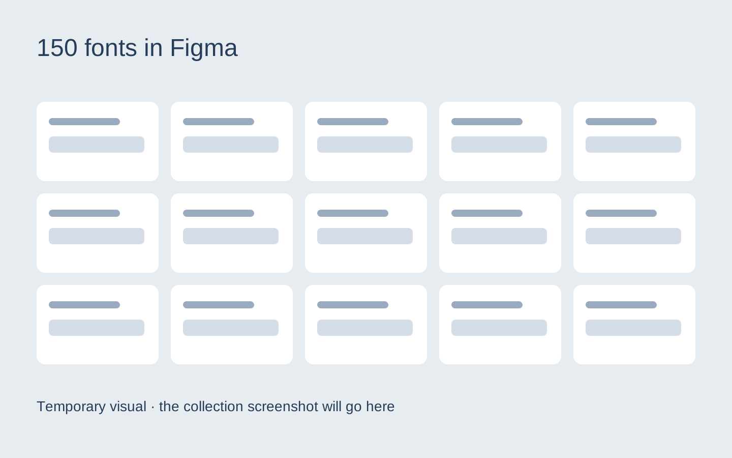
I gathered 150 fonts in a single Figma file so you do not have to search across different websites and open dozens of tabs every time you need a new option.
Each font is shown visually inside the file, so you can quickly browse the collection, compare styles, and decide which one fits the project.
The collection focuses mainly on fonts that work well in visual design and large headlines — for ad creatives, websites, posters, branding, and similar projects.
No need to search for every font separately
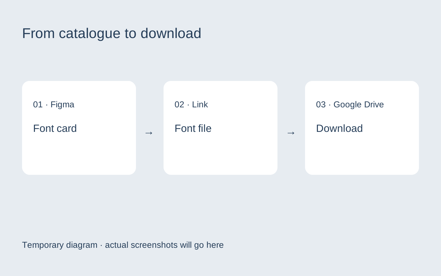
Each font in Figma includes a link to its file in Google Drive.
The workflow is simple:
open the collection → find a font you like → follow the link → download it.
Figma works as a visual catalogue: you choose the font by looking at it first, then move on to the download.
This is especially useful with display fonts. Their names are easy to forget, and searching for new options through Google, Pinterest, and different font websites every time quickly becomes inconvenient.
What’s inside
The collection includes 150 fonts with different styles and personalities:
- expressive headline fonts;
- bold options for ad creatives;
- editorial styles;
- fashion-oriented typefaces;
- experimental typography;
- decorative fonts;
- more restrained options for websites and branding.
You can use the collection as your own working reference and come back to it whenever a new project calls for a different typographic direction.
150-font collectionLink will be added
How to use the collection
There is no need to save all 150 fonts at once.
For a new project, open the collection and choose three to five options that fit the mood you are after. Then set the actual project headline in each font and compare them directly in the layout.
Most of the options usually become easy to rule out at that stage.
That is what makes a visual collection faster than a plain list of font names: you see the personality of the typeface first instead of searching for it blindly by name.
Final thoughts
A good headline font does not have to be universal. Sometimes the opposite is true: the stronger its personality, the fewer extra elements the design needs.
Save a few options from this list, test them with your own copy, and if you want a larger selection ready to browse, use the full collection of 150 fonts in Figma.
